A residential development in Burg, in the Wynental — made clear, credible and ready to sell long before the first wall stood.
.avif)
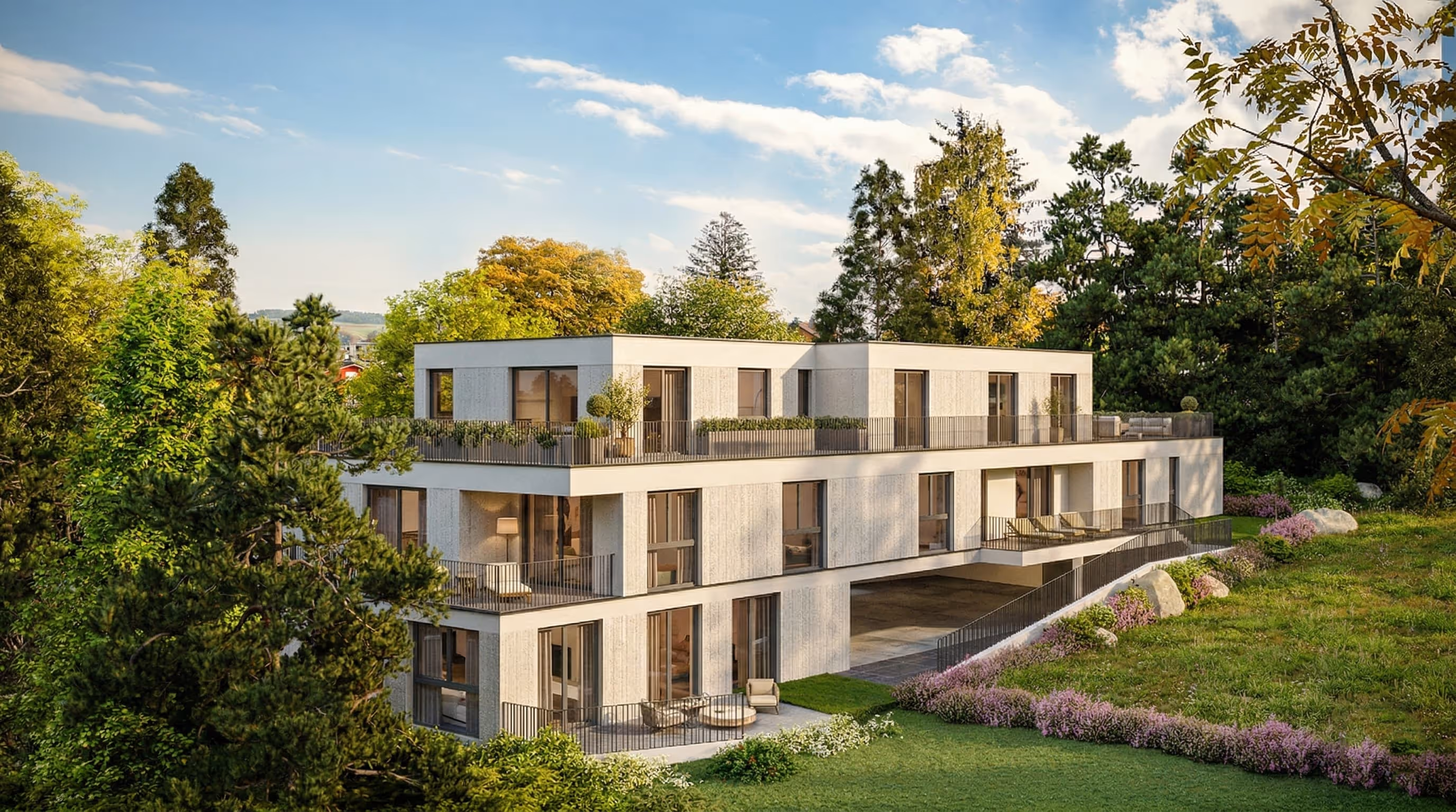
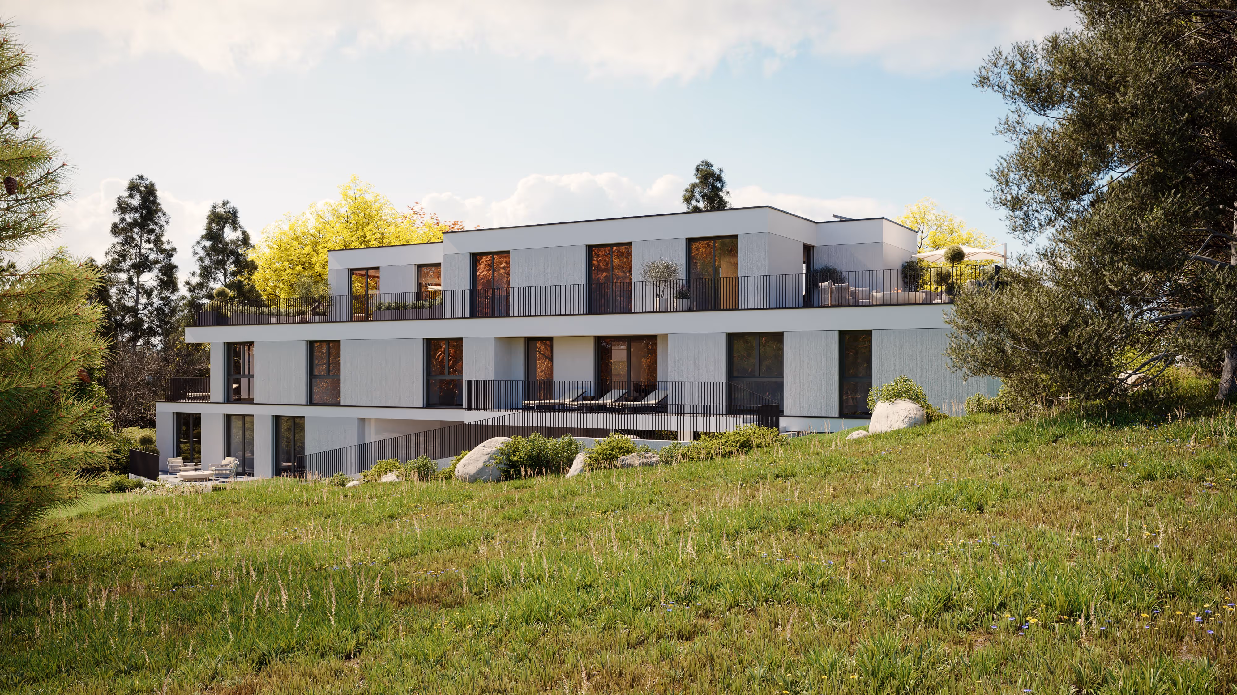
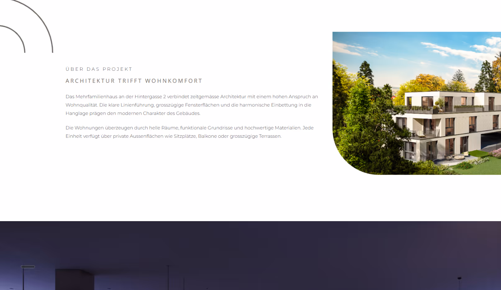
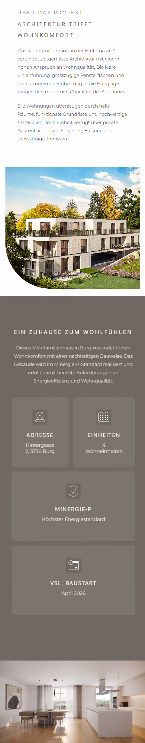
Bellevue Wynental is a residential development at Hintergass 2 in Burg, set in the Wynental, where the value of the project rests as much on its setting and views as on the architecture itself.
For a buyer or investor, the challenge was to understand the quality of the future residences before the project could be experienced physically. The communication therefore needed to translate plans, views and technical information into a calm, credible and desirable project presence.
Cloudonpoint supported the project by creating the digital layer around it — architectural visualisation, project identity, website presentation and sales-oriented communication. The objective was not only to show the building, but to make the project easier to trust, easier to understand and easier to discuss commercially.
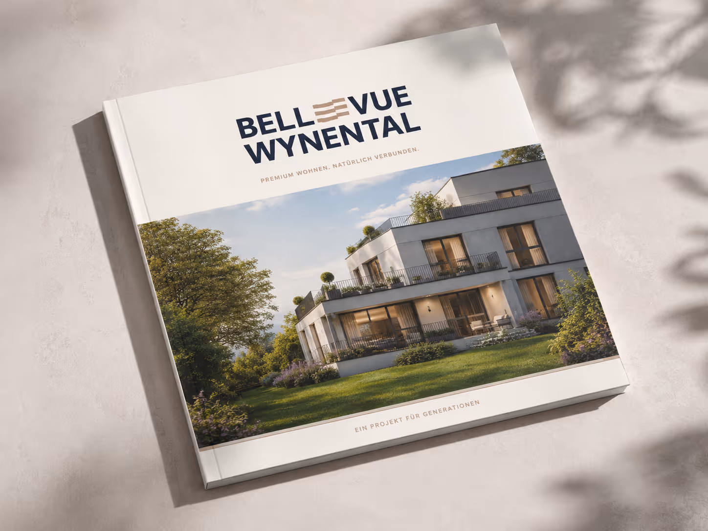
The project presentation brings together the key assets created for Bellevue Wynental — from architectural visualisation and project identity to the digital experience and sales communication materials.
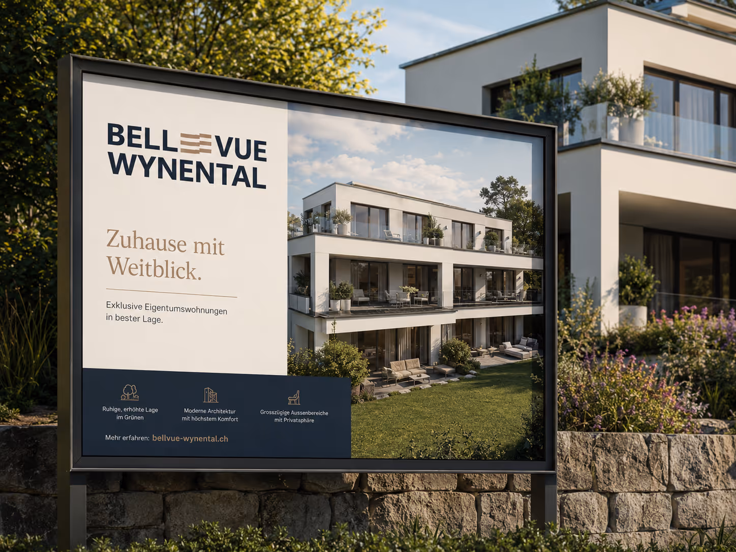
Exterior imagery and atmosphere views that make the future development tangible before it exists. Honest light, real materials, no over-styling.
A focused digital environment presenting the project, the setting and the commercial information with clarity. Built to convert enquiries.
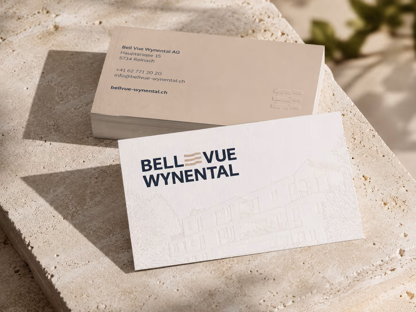
Materials and content structure designed to support early conversations with buyers and stakeholders — print, PDF and follow-up emails.
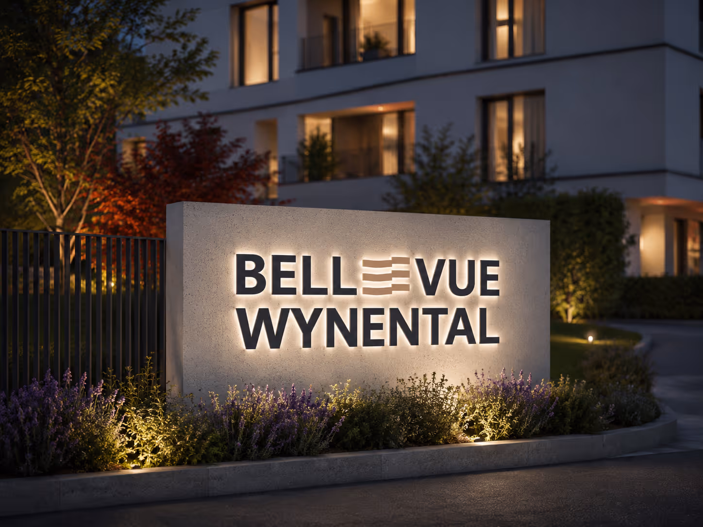
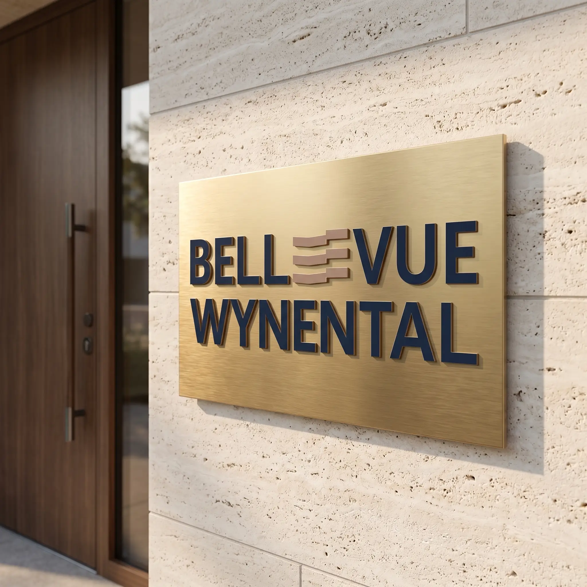
A restrained visual language that gives the project a recognisable and credible presence across every touchpoint of the commercialisation phase.
From the project mark to the brochure, fact sheet, palette and typography — every artefact is built from the same hierarchy of light, restraint and clarity, so the project speaks with one voice on screen, on paper, and in conversation.
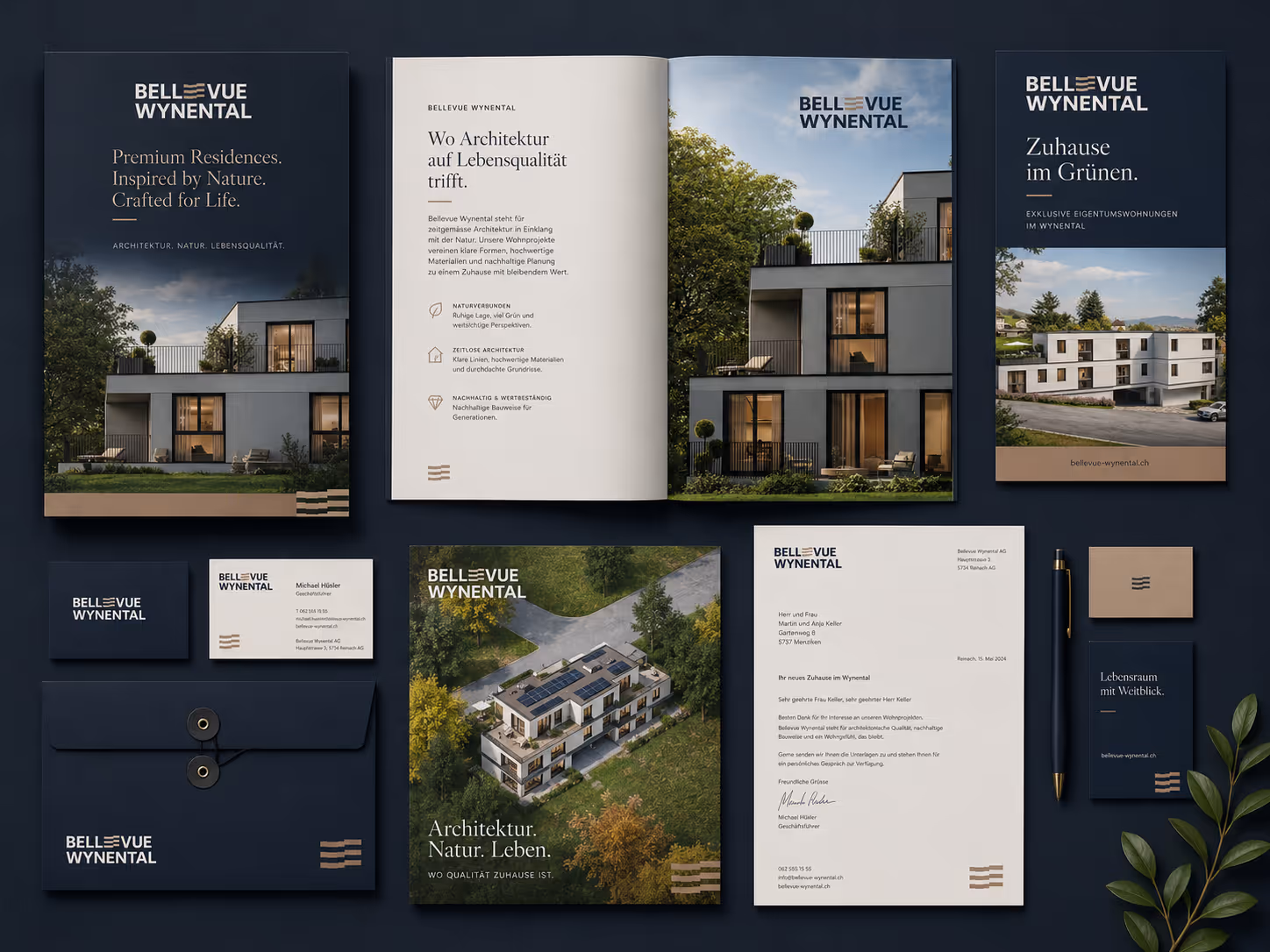
Logo, stationery, colour system, project mark — designed as a single, coherent identity for the development.
Deep navy carries the brand, with warm taupe and cream drawn from stone and daylight.
A high-contrast serif lockup for the project name, paired with Montserrat for body text and apartment information.
“A view worth coming home to.”
Calm, confident, location-led. Short sentences. Concrete nouns. Never marketing-speak.
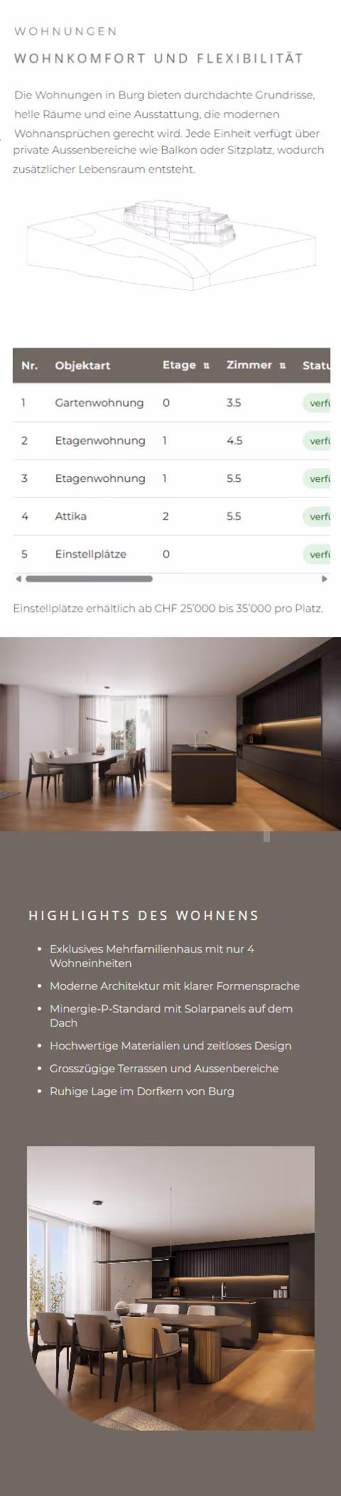
Floor plans, fact sheets and apartment-level material were produced as part of the same visual system — readable, calm, and built to support a buying decision.
For Bellevue Wynental, the website is not treated as a simple online brochure. It is the place where visuals, information and project confidence come together to guide the visitor from first impression to enquiry.
Most enquiries arrive from a phone. The mobile experience carries the same hierarchy, typography and atmosphere as the desktop site — designed to lead the visitor from first impression to apartment overview to enquiry without friction.
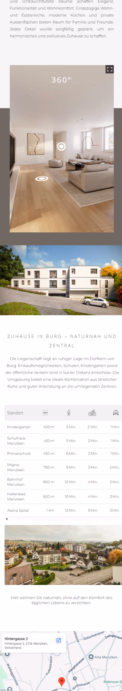
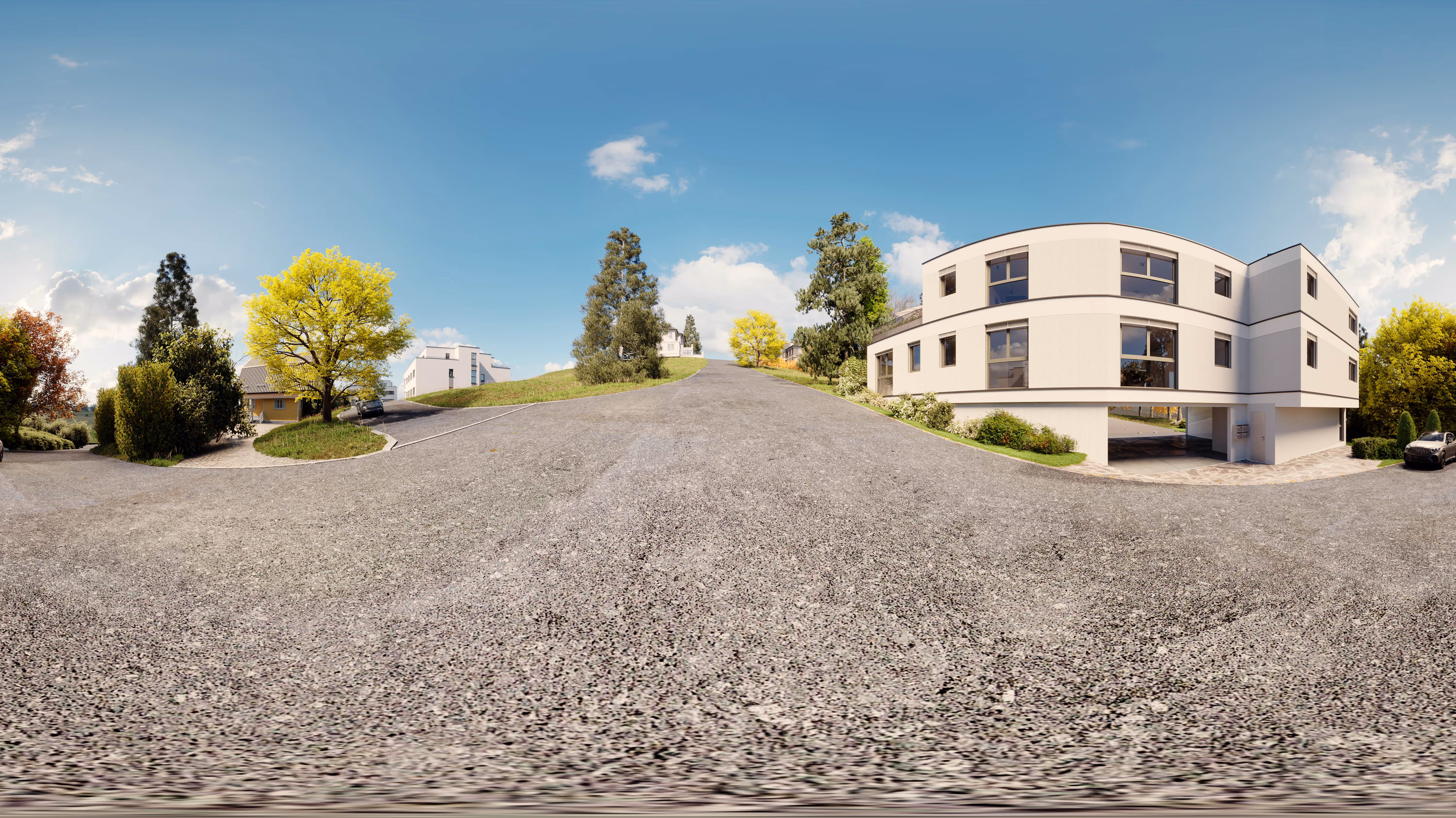
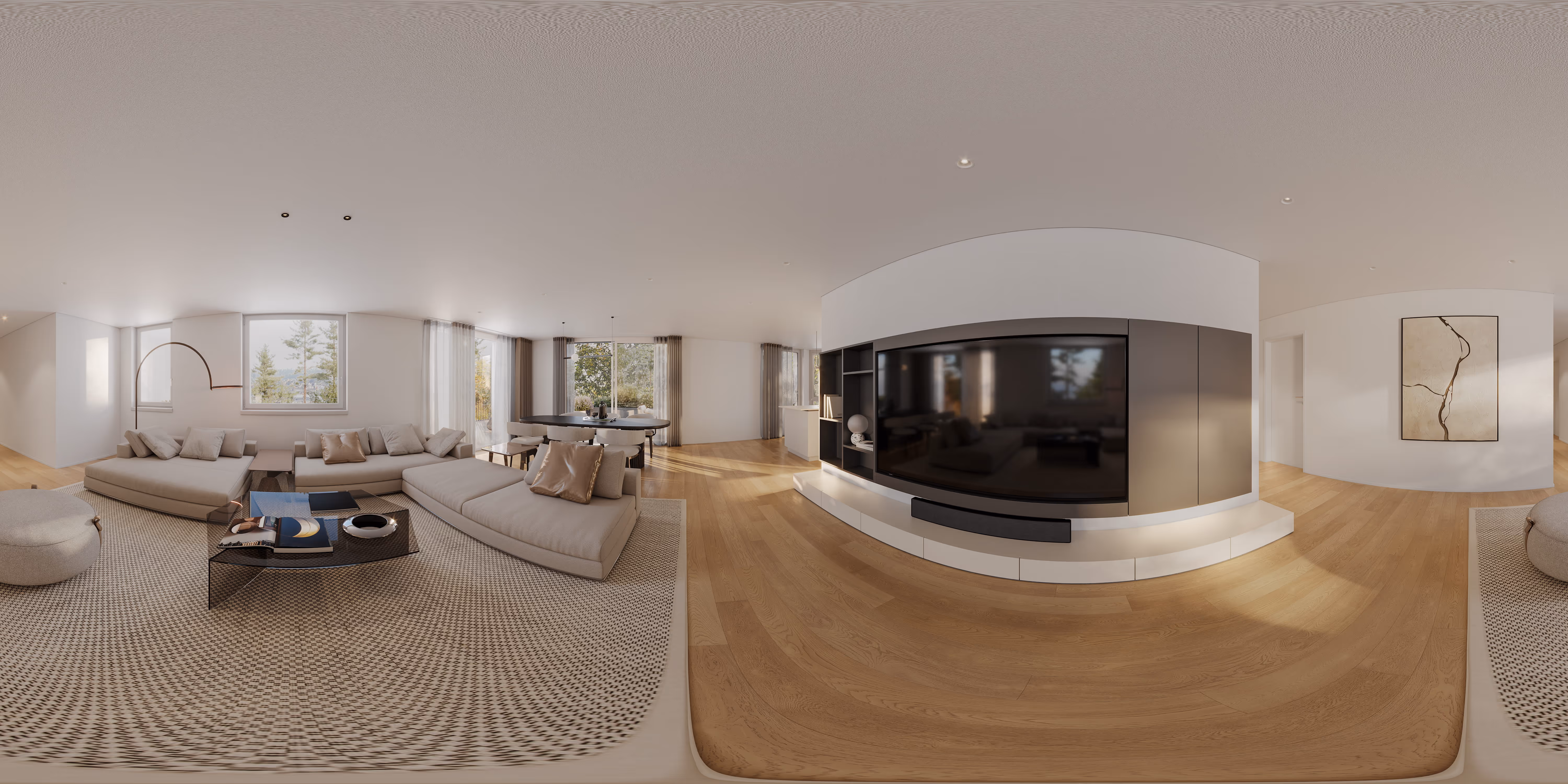
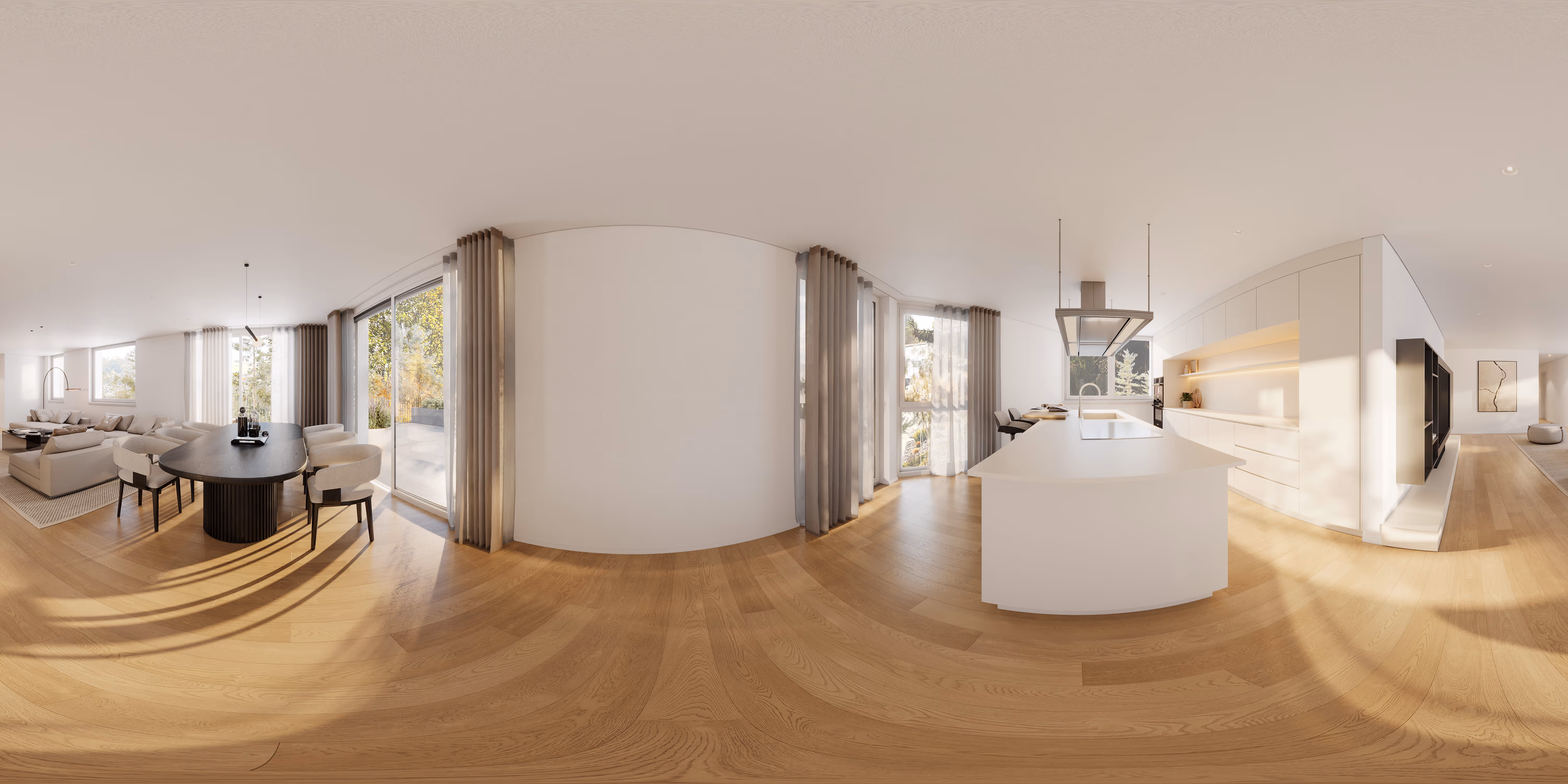
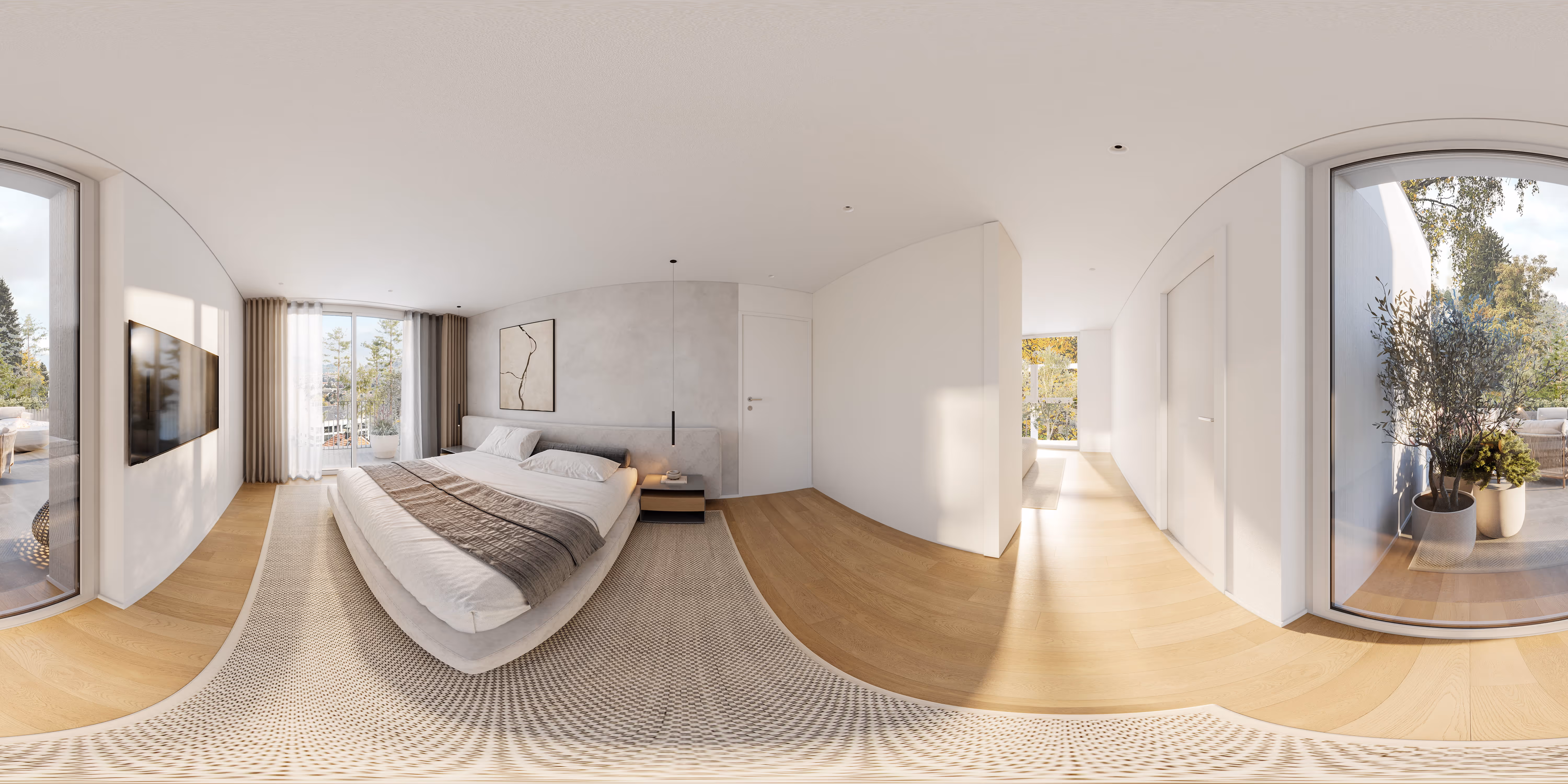
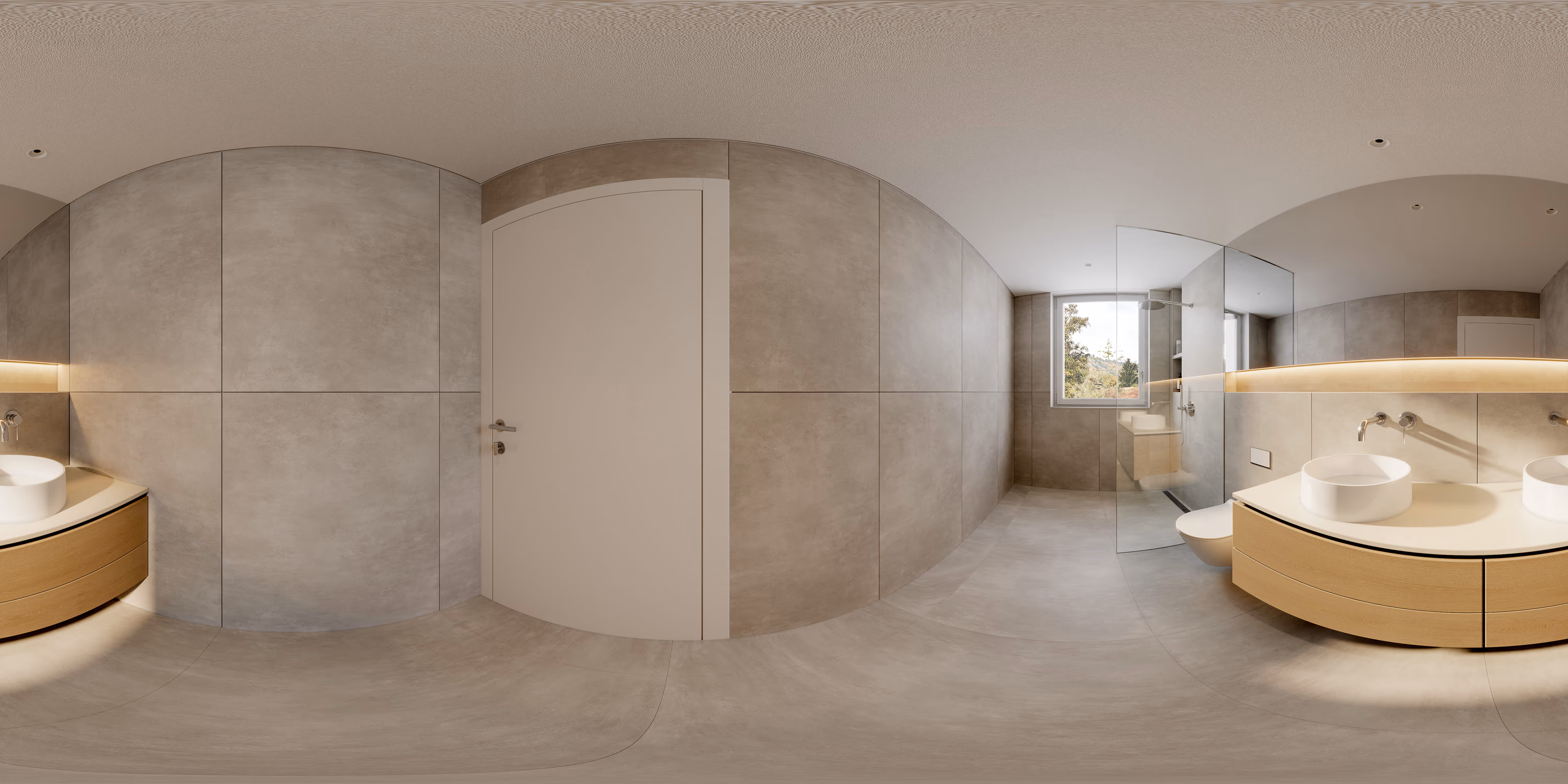
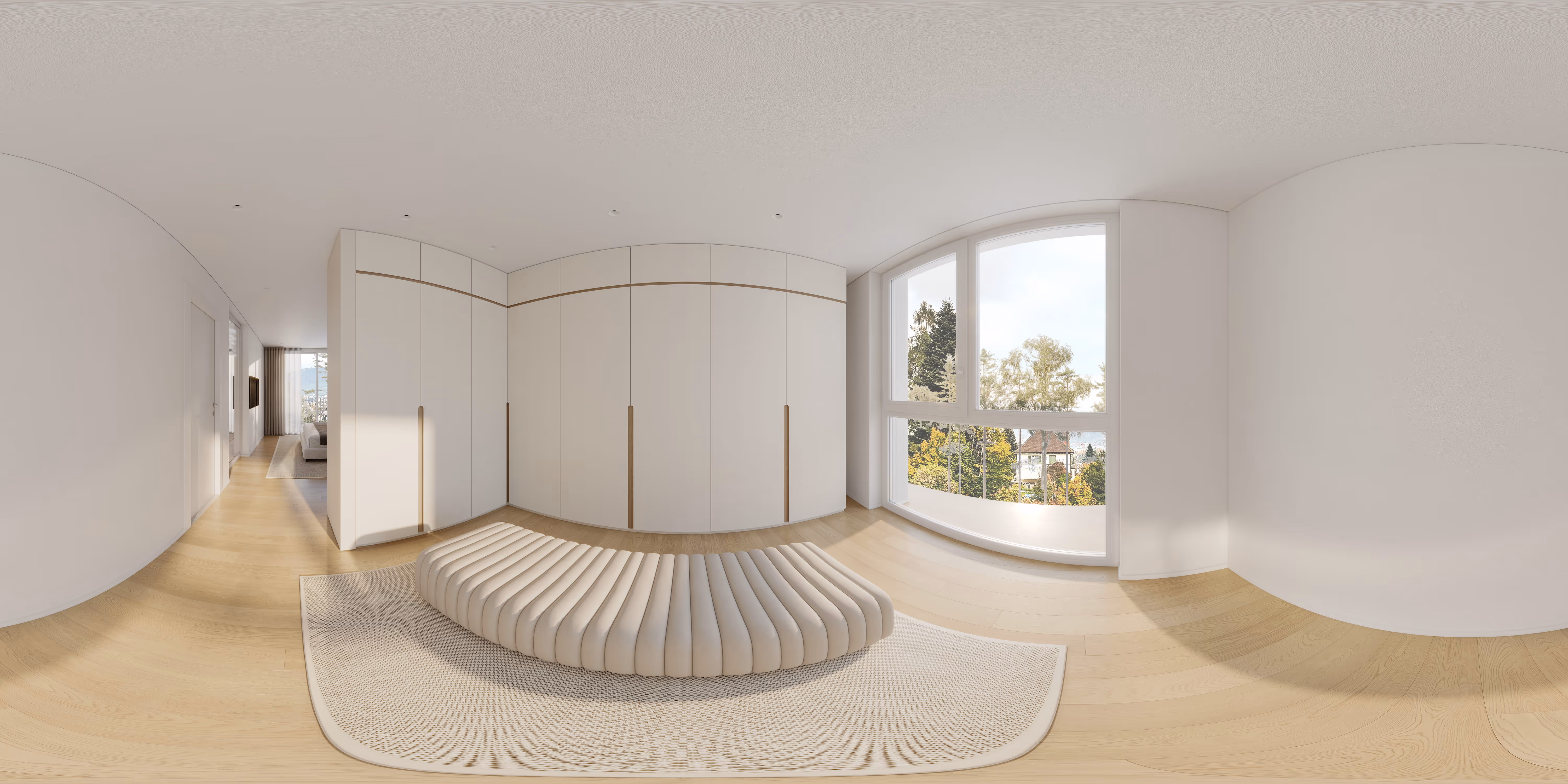
A 360° perspective gives future buyers and stakeholders a more complete sense of space, orientation and atmosphere. It helps the project feel less abstract and allows the viewer to move from simply seeing the development to mentally entering it.
01
Exterior
02
Living room
03
Kitchen
04
Bedroom
05
Bathroom
06
Dressing room
Real WebGL equirectangular projection (Pannellum). Drag to look around, and click the white markers to walk between rooms.
A reading of the development across its exterior, interiors and apartments — each frame built from the same hierarchy of light, restraint and clarity.
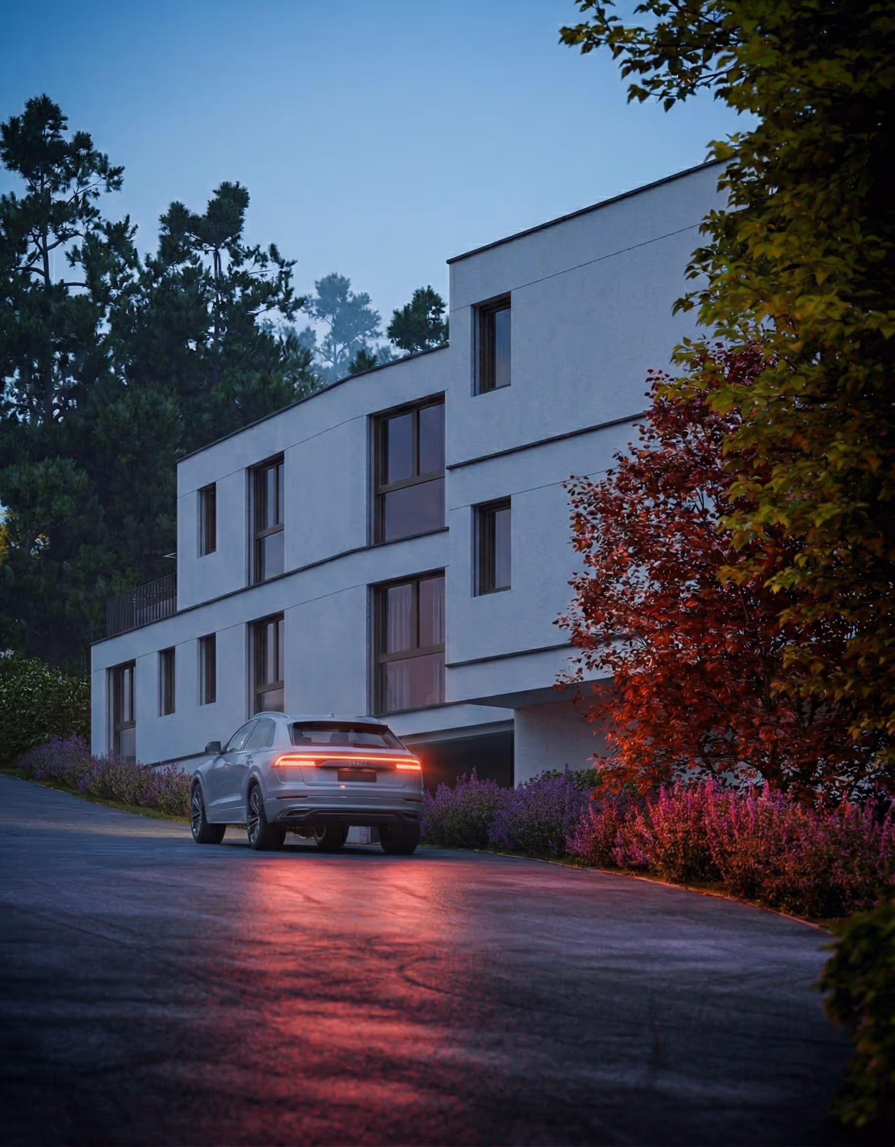
Street elevation at dusk
01 / 06
.avif)
.avif)
.avif)
.avif)
Cloudonpoint helps real estate developments become clearer, more credible and more sellable before they are built.


.avif)
.avif)
.avif)